Vaccine Efficacy in Young Age Groups
Is there any justification for vaccine pressure in the data?
How can we check the efficacy of vaccines? Different reports are produced each week showing ratios of infections, hospitalisations and deaths in vaccinated versus unvaccinated people but how can we be sure that they are comparing like for like? Maybe the unvaccinated population contains a larger amount of people with co-morbidities and so were too ill to be vaccinated in the first place? The UK Health Security Agency reports that 34,289 immunosuppressed individuals have not been vaccinated with two doses and 95,916 are yet to have three. These are small numbers in the scheme of things but could easily skew the figures.
Additionally, comparing hospitalisations and deaths over different periods of the year wouldn’t work either, as seasonality plays such a huge part in how viruses interact with humans.
Surely, comparing numbers of hospitalisations and deaths at the same time of year would give an indication of whether vaccines are working or not. Especially if one year there were no vaccines and in the next a high proportion of people were vaccinated. I thought so anyway, so I decided to first compare number of patients admitted with COVID-19 and number of inpatients diagnosed with COVID-19 by age group. I know ‘WITH COVID-19’ stats aren’t ideal but it’s all there is.
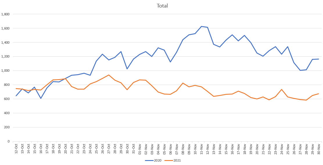
The first data set is from the UK’s National Health Service (NHS) website and includes data from 12 October 2020 to 30 November 2021. Therefore, there are overlying dates over two years between 12 October and 30 November 2020 and 2021. This is only a short time frame (just under a month and a half) but again, it’s all we have. The data is broken down by various age groups (0-5; 6-17; 18-24; 25-34; 35-44; 45-54; 55-64; 65-74; 75-84; 85+).
Looking at the data all together (chart above), the number of deaths start following the same path but then clearly diverge before starting to reconverge as admissions drop faster in 2020 than 2021. They subsequently start rising quickly in December 2020 overall (not on the chart) and less so in 2021 so far but the data broken down by age for that period is not available yet. There is a clear difference in the year without vaccines and the year with. However, let’s separate those data out by age.
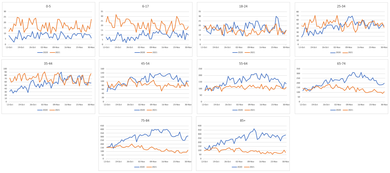
As you can see, the two age groups (0-5 & 6-17), with almost zero vaccines administered, have actually had more admissions this year, compared to last year. Next, all the age ranges from 18-24 to 55-64 barely show any difference in admissions with vaccination rates ranging from 60% in the lower age groups to almost 90% in the older age groups.
From 65 years upwards, where vaccine uptake is 90% plus, the difference in admission levels remains and is clear. This may stay like that, in which case, there is a clear indication that vaccination is beneficial for the older age groups or it may reconverge like some of the younger age groups did, just at a slower rate (e.g. as is visible towards the end of the charts in the 45-54 and 55-54 year olds).
We will have to see how the next data release changes things but from the data presented above so far, there is no clear benefit in vaccinating under 65 year olds when it comes to hospital admissions.
My one proviso concerns the data for the 0-5 and 6-17 year olds. Clearly in the groups that have had almost no vaccines, admissions are higher this year, compared with last year. Could this be due to behavioural differences between the years? For example lockdowns last year meaning youngsters were not taken to socialise and pick up viruses. Could it just be a testing issue, with more thorough testing regimes being undertaken this year? Or something more sinister such as a version of Marek’s disease occurring in the unvaccinated? Could the vaccination rates of slightly older age groups be masking the same differences. Who knows, the data range is too small to tell but definitely something to keep an eye on as more data is released.
Next, on to numbers of COVID deaths by age, again from the NHS website. This time the data starts in March 2020 and ends a few days ago (updated regularly). By comparing March 2020 to December 2021 in both years we can get a good like for like comparison. However, instead of starting each data set in March, I started counting when the vaccination programme for that age group started to reach its peak. The reason for this is that before that period, there would not have been many people double vaccinated and so it would be impossible to tell if vaccines were having any effect. The age ranges here are 0-19; 20-39; 40-59; 60-79 and 80+. For the youngest group I included the whole year due to its minimal vaccination programme so far but for the other age groups I started in August (20-39) mid Jun (40-59), mid May (60-79) and the end of April for 80+.
I had to create three separate graphs as the low number of deaths in the younger age groups made it hard to see, compared with the older groups. For the age groups under 60, COVID-19 deaths (once peak vaccinations had been achieved), are worse in 2021 than they were last year without vaccinations. As with the admissions data, there is only a clear vaccine effect in the over 60s group.
As discussed above, what could be the reasons for the difference in the data? The 40-59 age group has approximately an 80% vaccine take up but COVID-19 deaths are almost 50% higher than last year. Would we see similar results in the older age groups if there hadn’t been so many deaths earlier in the year resulting in a less vulnerable older population remaining? Or, as suggested above, is some sort of Marek’s disease occurring in the younger age group, which is being masked by the number of vaccinated people in each category?
Assuming the reason is due to a stronger remaining older population, it is clear that vaccinations for under 60s is having a negative effect on both admissions and deaths. It seems ridiculous, therefore, to continue to pressure more youngsters in to getting vaccinated or boosted without further analysis and review.


Under a null hypothesis of zero VE for deaths and hospital admissions, I would think that we'd reasonably expect both covid deaths and hospital admissions in 2021 to be lower than in 2020 (possibly significantly, but that depends on things like the absolute and relative prevalence of c19 in the two time periods), due to (1) all the natural immunity acquired since 2020, (2) the "stronger 2021 survivor cohort" effect you mention, (3) the fact that delta and omicron (2021) are less severe than the 2020 strains, (4) possible placebo effects as mentioned by Barney, (5) probably lots of other reasons I haven't thought of (e.g. more people realising by now that fresh air, exercise, vitamin C/D etc are helpful compared to 2020 etc).... So it's not clear to me that these charts show any evidence for vaccine efficacy for any of the age groups
I will dare say that the main positive effect (to the detriment of injection success claims) on deaths of 60+ age groups was a type of placebo effect that injections engendered on the most at risk group. They were offered hope where previously there was despair. The elderly found themselves able to resume a sense normalcy and look forward to living. I assert the RCT success of Fluvoxamine as a plank of support to this theory.