Correlation between increased mortality rates and the vaccination programme in England
I’m going to write some articles on coronavirus with the intention to spark discussion, debate and hopefully to enable me and everyone participating to get some clarity on what is happening in the world, what should be happening now, what should or should not have happened already and what should happen in the future.
There is a lot of discussion and analysis of transmission and infection rates in vaccinated vs unvaccinated individuals, especially since the UKHSA (UK Health Security Agency) publications have been showing much higher infection rates in vaccinated individuals (as opposed to unvaccinated) over the age of 30. So, instead, I thought I would take an initial look at deaths in vaccinated vs unvaccinated individuals to see if it is possible to tease out what the situation is like there. It is more important to focus on deaths because transmission can be as high as it likes but if no one dies then it matters less (setting aside the hospitalisation and related illnesses issues). Of course, we read on a daily basis that vaccinations are saving thousands of lives, and this may be so, but can we see that in the actual data. Increasingly, countries around the world are imposing restrictions on unvaccinated individuals, so are there any data actually supporting this (moral, ethical and human rights issues aside)? There have been many studies showing how well vaccines are doing, due to the data ranges being from earlier in the year (when not many people were fully vaccinated). This early date range actually makes them quite misleading, so I think it is important to try and show an accurate picture.
To summarise my analysis and findings below (as it can get quite technical), there seems to be an extremely close correlation with the vaccination programme and an increase in mortality rates. As the first dose programme ramped up, so did mortality rates in the unvaccinated. As the second dose programme ramped up, so did mortality rates in the one dose group. This doesn’t make any sense. It seems to me it might indicate either a delay in reporting or mis categorisation (i.e. first dose deaths are being reported as unvaccinated deaths). This correlation occurred at different times of the year (depending on when the vaccination programme took place for that age group) which strengthens the correlation argument and diminishes the seasonality or COVID arguments. Furthermore, there was a longer period of high mortality rates after the second dose programme, which occurred during the warmer months when COVID deaths were very low. When exploring how many deaths occurred in these mortality peaks, the total came to approximately 42,764 additional deaths when compared with the averages.
The most up to date dataset in the UK (from what I can see, so please let me know if I’m wrong), is from an ONS document released on 01 November 2021. This has age-standardised mortality rates and age-specific rates for deaths involving COVID-19 and all deaths by vaccination status between 2 January and 24 September 2021.
As there is a lot of conjecture about whether a death has actually been caused by COVID, or just occurred with COVID or coronavirus present, I decided to first look at age-specific mortality rates by vaccination status for ALL deaths in the report. There are many things we can still be uncertain of (delay in reporting, misallocated vaccination status etc) but at least we can be certain that these deaths occurred at around the time reported, as someone can only be dead or alive.
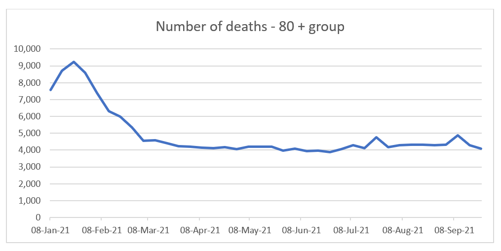
The report categorises the age ranges as follows; 10-59; 60-69; 70-79 and 80+. It is important to look at the data broken down by age because due to a statistical phenomenon called Simpson’s paradox, if the ages are reported together it can completely reverse what the actual data is telling us. For this reason, I will concentrate on the last three age ranges and miss out the 10-59 category (which, in my opinion is still too broad). If the data is not also separated by vaccination status, we still can’t get a clear picture, as demonstrated in the chart below.
When we purely look at number of deaths in all vaccination categories, this shows (for the 80+ group above) a clear peak in January, before a sharp fall and then remaining relatively flat for the rest of the year. Compare this with the charts below and see how different the charts are once the data is separated.
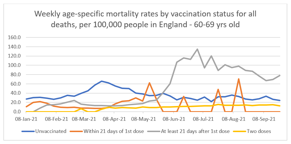
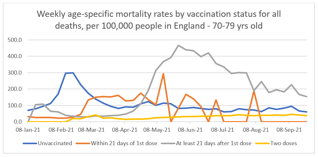
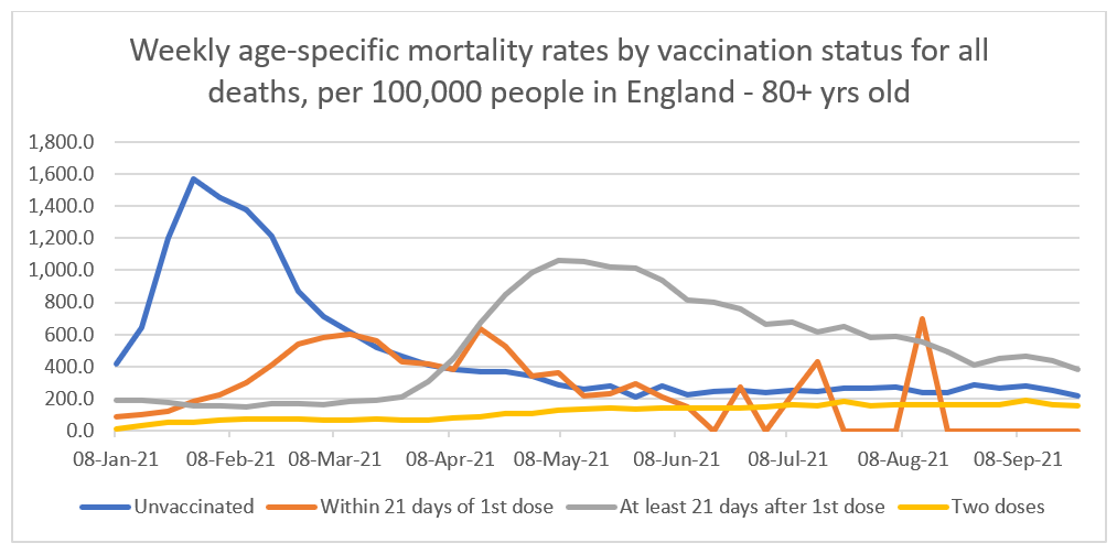
The first charts compare the age-standardised mortality rate for ALL deaths in the various age ranges.
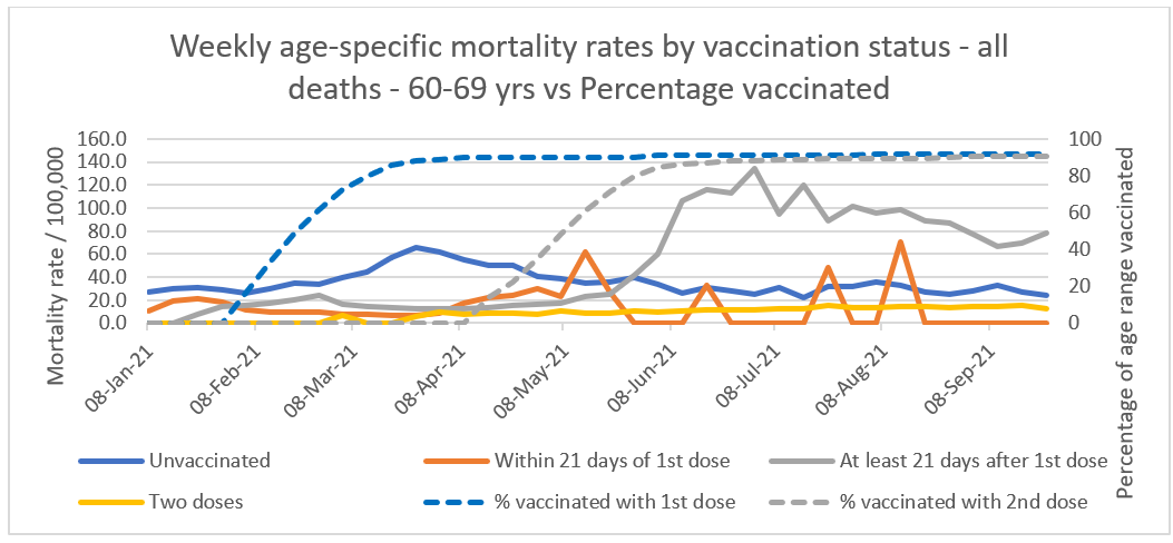
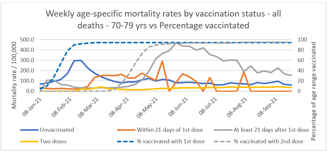
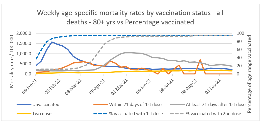
The things that jump out are the high peaks and then gradual declines in all the groups other than the ‘two dose’ group. What could be causing these high mortality rates and then gradual return to normal? Apart from the peak early in the year, there is no correlation with COVID death peaks. The ‘two dose’ group doesn’t really experience this and instead gradually rises all year.
What happens around this time which could give us some clues? Firstly, all of the peaks happen earlier in the year, the older the age group gets and secondly, these coincide, almost exactly, with the peak vaccination periods for those age groups.
This can be seen in the updated charts below. The unvaccinated mortality rates (solid blue lines) peak at around the time the 1st dose vaccination programme (dashed blue lines) starts to flatten off after accelerating upwards towards levels of 90% plus. At around the same time as the unvaccinated mortality rates peak, the ‘within 21 days of 1st dose’ (orange lines) mortality rate starts to rise. This peaks at around the time the ‘at least 21 days’ (solid grey lines) mortality rate starts to rise. The ‘at least 21 days’ mortality rate then peaks at around the same time the 2nd dose vaccination programme (dashed grey lines) starts to flatten off after accelerating upwards toward levels of 90% plus again. Notice how the dashed blue and grey lines correlate with the solid blue and grey lines and how this correlation starts earlier in the year, the older the age group. When the 1st dose vaccination campaign begins, the mortality rate for the unvaccinated group begins to rise and when the second dose campaign starts, so does the increase in the mortality rate for the ‘at least 21 days after 1st dose’ group.
This is unlikely to be a coincidence as the same increase, peaks and declines happen in all three age groups at the same time the vaccination programme ramps up and reaches approximately 90% plus. Clearly, the unvaccinated group are not suddenly dying at a higher rate as the vaccine programme ramps up, they haven’t been vaccinated. Similarly, people with only one dose can’t be dying at the time the second doses are being administered, they haven’t had a second dose, so it must be a case of delayed reporting and/or mistaken categorisation. If that is the case then the additional deaths from the unvaccinated group should be removed from that group and added to the first dose groups. Similarly, the additional deaths from the ‘at least 21 days after 1st dose’ group should be removed and added to the ‘two dose’ group. Answers on a postcard for any other explanations you may have.
Just after the ‘at least 21 days after 1st dose’ peak (grey lines), the unvaccinated (blue lines) and ‘two dose’ group (yellow lines) seem to start following the same path with a similar degree of separation. At this point, it seems the two groups are following a natural, seasonal path. My guess for the difference between the two is that the unvaccinated group will contain a percentage of people who are too ill to be vaccinated and the two dose group will contain a stronger population due to the more vulnerable already dying or not being able to have been given a second dose.
Can we estimate how many deaths occurred during these peaks, compared to the average? By calculating the average increase in mortality rates over the number of weeks it is possible to calculate as estimate of the amount of additional deaths happening during those peaks.
For the 60-69 group, during the unvaccinated peak, the average mortality rate was 47.7/100,000 over a 12 week period. The average mortality rate in total was 35.5 so an increase of 12.2. The average population size in that group over that period was 631,384. So on average, that equates to (631,384/100,000=6.3) * 12.2 * 12 = 922 extra deaths during the peak. In the ‘within 21 days’ group peak, the average mortality rate was 26.7/100,000 over a 9 week period. The average mortality rate in total was 22, so an increase of 6.7. The average population size over the period was 98,842. So on average, that equates to (98,842/100,000=0.99) * 6.7 * 9 = 59 extra deaths. In the ‘At least 21 days’ group, the average mortality rate was 89 over a 17 week period. In total it was 53.5, so an increase of 35.5. The average population size over the period was 182,371 which equates to (182,371/100,000=1.82) * 35.5 * 17 = 1,098 extra deaths. In total for this age group 2,079 additional deaths.
For the 70-79 group, during the unvaccinated peak, the average mortality rate was 171.8/100,000 over a 10 week period. The average mortality rate in total was 106.7 so an increase of 65.1. The average population size in that group over that period was 951,899. So on average, that equates to (951,899/100,000=9.5) * 65.1 * 10 = 6,184 extra deaths during the peak. In the ‘within 21 days’ group peak, the average mortality rate was 146.9/100,000 over a 13 week period. The average mortality rate in total was 110, so an increase of 36.9. The average population size over the period was 97,637. So on average, that equates to (97,637/100,000=0.99) * 36.9 * 13 = 474 extra deaths. In the ‘At least 21 days’ group, the average mortality rate was 316.3 over a 17 week period. In total it was 199.6, so an increase of 116.7. The average population size over the period was 239,000 which equates to (239,000/100,000=2.39) * 116.7 * 17 = 4,741 extra deaths. In total for this age group 11,399 additional deaths.
For the 80+ group, during the unvaccinated peak, the average mortality rate was 921/100,000 over a 12 week period. The average mortality rate in total was 480.8 so an increase of 440.2. The average population size in that group over that period was 410,382. So on average, that equates to (410,382/100,000=4.1) * 440.2 * 12 = 21,657 extra deaths during the peak. In the ‘within 21 days’ group peak, the average mortality rate was 401.6/100,000 over a 17 week period. The average mortality rate in total was 352.7, so an increase of 48.9. The average population size over the period was 258,061. So on average, that equates to (258,061/100,000=2.58) * 48.9 * 17 = 2,144 extra deaths. In the ‘At least 21 days’ group, the average mortality rate was 703.1 over a 23 week period. In total it was 520.8, so an increase of 182.3. The average population size over the period was 177,463 which equates to (177,463/100,000=1.77) * 182.3 * 17 = 5,485 extra deaths. In total for this age group 29,286 additional deaths.
A total of 42,764 additional deaths. Now, those peaks may have been COVID deaths, which we will look at below, but in any case, the clear link between vaccination timing and those increased mortality rates means vaccination still may have played a part in them. If that is the case, then there is increasing supposition suggesting a 2 - 3 week period of increased chances of catching coronavirus after vaccination, along with immunosuppression, so this may be an explanation for some of it, but further investigation is needed.
So, let’s look at how many COVID deaths occurred during those same periods and compare with the approximated additional deaths.
For the unvaccinated 60-69 year olds there were 988 COVID deaths during the same period. For the ‘Within 21 days’ group there were 2 deaths and for the ‘At least 21 days’ group there were 52 deaths. A total of 1,042 COVID vs 2,079 additional all cause deaths. For the unvaccinated 70-79 year olds there were 5,471 COVID deaths during the same period. For the ‘Within 21 days’ group there were 91 deaths and for the ‘At least 21 days’ group there were 111 deaths. A total of 5,673 COVID vs 11,399 additional all cause deaths. For the unvaccinated 80+ year olds there were 17,543 COVID deaths during the same period. For the ‘Within 21 days’ group there were 2,526 deaths and for the ‘At least 21 days’ group there were 592 deaths. A total of 20,661 COVID vs 29,286 additional all cause deaths.
Overall, during the peak vaccination periods for each age group (which coincide with peak all cause mortality) there were 27,376 COVID deaths vs 42,764 (approximated average) additional all cause deaths. Removing the COVID deaths from the all cause deaths, still leaves 15,388 additional deaths caused by some other reason during the high vaccination periods.
More worrying is the fact that the second dosage period caused the greatest period of increased mortality rates, as during this period, COVID deaths were very low. In the 60-69 group there were 52 COVID deaths vs 1,098, the 70-79 group 111 COVID deaths vs 4,741 and in the 80+ group 592 COVID deaths vs 5,845. Removing the COVID deaths leaves 10,929 additional deaths from other causes during the peak of the second dose vaccination period. This is significantly higher than the 4,459 estimated deaths, once COVID deaths are removed, during the first dose programme.
The timing between peak vaccination uptake and mortality rate peaks is too consistent between age groups to be ignored. An approximated 42,764 deaths during these peaks, may be excused by some to be due to COVID but as we have seen, less than half of these could be explained as COVID deaths, meaning something else caused them. Lockdown (delayed hospital treatment) or pandemic stress related deaths? The correlation with the timing of the vaccination programme makes this unlikely. Even if they were all COVID deaths (they’re not), the timing of the deaths with peak vaccination uptake means something connected with vaccination may have been facilitating COVID during that time (e.g. immunosuppression just after vaccination).
It would be useful to see the same data breakdown for smaller age groups in the 10-59 year group. I’m guessing the pattern would be the same, with peaks later on in the year but with much fewer deaths (due to younger people having a statistically smaller chance of dying). If the above observations are correct, then with 3rd dose vaccinations under way, we can predict the following: Once the data is broken down by age group, mortality rates will increase as vaccination rates intensify. There will be more all cause additional deaths than COVID deaths and these may be mistakenly categorised as deaths in the 2 dose group, as opposed to the 3 dose group. This mis categorisation may be used as evidence of waning vaccine efficacy and used to encourage people to get boosters.
It would also be useful to see the data broken down by ‘within 21 days of 2nd dose’ and ‘at least 21 days of 2nd dose’. In the definition page of the data, this breakdown is defined but does not appear in the data itself for some reason.
Importantly, we should see if the approximated additional deaths are actually excess deaths. Is this purely a mis categorisation issue or are there excess deaths occurring in certain groups? I don’t think we can say, again due to Simpson’s paradox, unless we can see the data broken down by age AND vaccination status (although this will be tricky as there would be no excess averages to compare with due to there not being vaccines before this year). Otherwise, on average the graphs may show no excess deaths, when in reality there may be excess deaths in one group which are being counter balanced by negative excess deaths in another group.
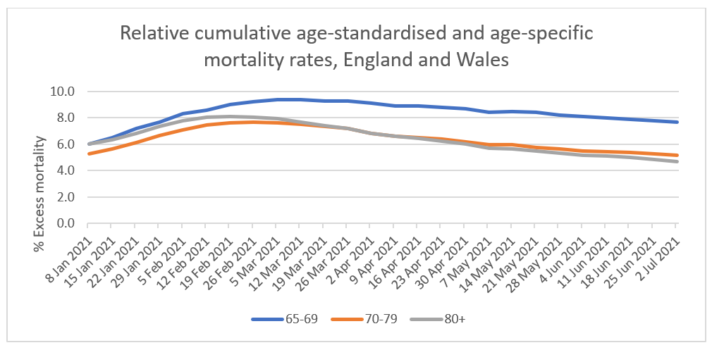
There isn’t like for like data to decide whether these are excess deaths or not but looking at what is available, excess deaths are still up between 4-8% in the discussed age groups (See chart below from ONS document titled ‘Excess mortality and mortality displacement in England and Wales: 2020 to mid 2021 – 15 Oct 2021). This excess rose and peaked early in the year but was still in the excess territory in July. Again, this increase was inline with the vaccination programme and occurred earlier in the year depending on when the programme took place. At the same time, one could argue that the increase in excess deaths occurred during high COVID deaths and the drops occurred as the vaccinations took effect. However, the rise in excess deaths continued well after the COVID deaths peak and the timing with the vaccination programme should be looked at.
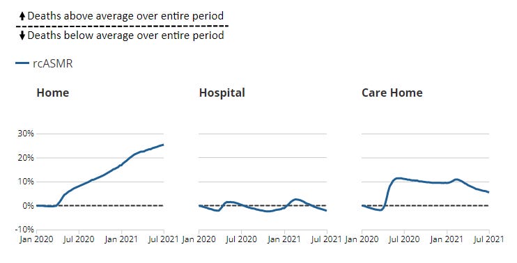
What is also interesting / worrying is that the majority of these excess deaths are occurring predominantly at home and in care homes, rather than in hospital (see charts below from the same ONS document above).
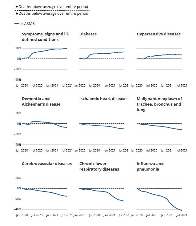
Another interesting statistic is what is causing these excess deaths. Not influenza, pneumonia or respiratory diseases as you might think but hypertensive diseases, diabetes and the biggest rise is in ill-defined conditions (See chart below). Some of these may be explained by lockdowns but ill-defined conditions is a worry.
Finally, to look at absolute numbers I looked at the ONS dataset entitled ‘Excess mortality and mortality displacement in England and Wales 2020 to mid 2021’. Up to July, just in England (as with the analysis above) this showed 679 excess deaths in the 65-69 age group (it did not have 60-64 for some reason). There were 8,789 excess deaths in the 70-79 group and 7,813 for the 80+ group. In total 17,281 excess deaths up to July, which somewhat correlates with my calculations above (once COVID deaths have been removed). Now the majority of these occurred during the COVID peak and so shows little correlation with the vaccination programme. However, it doesn’t show any vaccine effects either, as all age groups peak and fall at the same time. As discussed above, we would need to see the same data but by vaccination status to determine whether excess deaths mainly occurred during the COVID peak.
To summarise, for each age group, as the vaccination programme accelerates before reaching approximately 90% plus, increased mortality peaks can be observed, both for the first and second dose. These peaks change depending on when the acceleration occurred for each age group. For some unexplained reason, the increased mortality during the first dose programme, results in a mortality rate peak in the unvaccinated group. In the second dose programme, the peak occurs in the 1st dose group suggesting a delay in reporting and/or mis categorisation of vaccination status. In total there were approximately 42,764 additional all cause deaths during these peaks. Removing the COVID deaths from this amount still leaves 15,388 deaths from something other than COVID, a high proportion of which occurred during the second dose programme. As there is such a close correlation with the timing of the vaccination programme, it is reasonable to investigate whether the vaccines were supressing immune systems making individuals more susceptible to COVID and whether it contributed, in any way, to the deaths of elderly, vulnerable and individuals with unknown comorbidities. Furthermore, if it can be proven that these deaths are not in fact excess deaths, the link with the vaccination programme should still be examined, as these may just be deaths in the vulnerable and elderly that have been pulled forward (death displacement) but still as a consequence of the vaccination campaign.
It will also be important to understand whether there has been some mis categorisation in the data because, even if it can be shown that none of the deaths were excess deaths, that would heavily impact on the claimed efficacy rates of the vaccines. If this were to be the case, Emergency Use Authorisation of the vaccines would be dubious and the case for any restrictions on the unvaccinated or implementation of vaccine passports, unfounded.
Any other explanations for the observations above will be warmly received, so please subscribe below and post a comment to discuss.


That red line having such sharp increases seems a little odd. You'd expect it to be a little more consistent no? Are they jags corresponding to vaccination campaigns?
Just wondering how long it takes for the vaxed to be registered for the first dose