I recently saw the video below showing the changing positions of the world’s 10 richest women since 2020. They swap positions and some get relegated out of the top 10 whilst others get promoted up. The list of all the women who have entered the top ten over the last year is (I don’t know how accurate the list is but it’s safe to say these are very rich women):
Julia Flesher (Koch)
Françoise Bettencourt Meyers (L'Oréal)
Alice Walton (Walmart)
Jacqueline Badger Mars (Mars)
MacKenzie Scott (Amazon)
Elaine Marshall (Koch)
Gina Rinehart (Hancock Prospecting)
Susanne Klatten (BMW)
Abigail Johnson (Fidelity Investments)
Iris Fontbona (Antofagasta)
Miriam Adelson (Las Vega Sands)
The first thing to note, and something which will come as a surprise to no one, is how many of the top ten inherited their wealth. It’s so great that we have a meritocratic and non-nepotistic system in place. Of the 11 women who were in and out of the top 10 over the last few years, eight inherited their wealth (Julia Koch, Françoise Bettencourt Meyers, Alice Walton, Jacqueline Mars, Elaine Marshall, Gina Rinehart, Susanne Klatten and Abigail Johnson). The other three acquired their wealth through marriage (MacKenzie Scott, Iris Fontbona and Miriam Adelson).
Another thing to note is the origin of much of the wealth. For example there was a 2011 study about the Quandt family (of which Susanne Klatten is a member) which concluded that “The Quandts were linked inseparably with the crimes of the Nazis”. But don’t concern yourselves with such trivialities, that’s all in the past (sarcasm).
However the thing I did notice and what I was intending to write about was the similarities in so many of the logos.
Three out of the ten logos have a similar design (plus there are two Kochs in the top 10). I’ve put the relevant parts of the logo next to each other so you can compare.
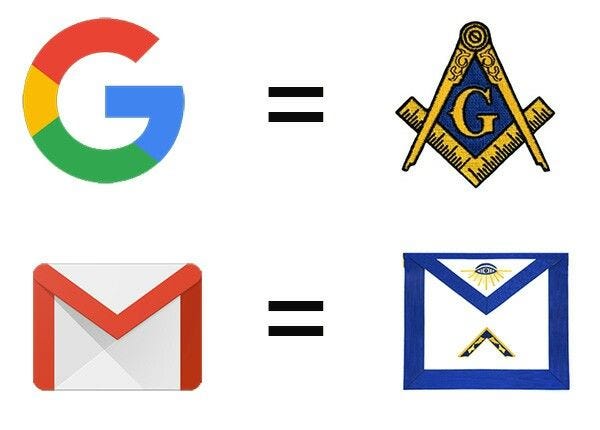
Look closely and they look very similar to masonic logos. Also similar to Google logos which some have claimed look masonic.
And then there is Fidelity’s logo which doesn’t need any explanation.
As humans, we are prone to see patterns in everything, even when in reality there are none. Furthermore, many corporate logos begin with capital letters. Combine this with group think and design companies ‘borrowing’ each others fonts and designs and you can inadvertently be left with similar looking logos.
Or logos and symbols are used to send messages about a company (whether consciously or subconsciously) that only a few will decipher.
I am undecided. Do I enjoy looking for patterns too much or are these designs deliberate. What do you think?


And it all started on the back of Federal Reserve Notes?
First, why the use of “symbology” and not “symbolism?”
Second, everybody claims to want to be different but most folks want to be like everyone else. For example, I created a unique design for our company website but the boss asked, “Why doesn’t it look like [insert direct competitor name here]’s?!” I went back to the drawing board, copied the format and design of our direct competitor, made a few slight changes in design and color to make it seem different, and the boss LOVED it (while the exercise was extremely boring for me). A couple months later, I noticed the direct competitor stole a few of my tricks.
Third, graphic design is pretty limited anyway. You need to keep things simple so the message is immediately received. I recommend watching “Helvetica” to see how basics is best.
Fourth and finally, that list says a lot about a woman’s ability (or lack thereof) to make it big on her own.