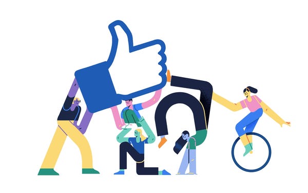
Globohomo (global homogenisation), Big Tech, Humans of Flat, Corporate Memphis or Alegria art. Whatever you want to call it, you have probably noticed this style of art all around you without realising what it is. It is a corporate favourite and everywhere you turn, another company is using it to sell you something. Reading a recent Spartacus article, which touched on the subject, made me look into it further.
This new totalitarianism does not use boldly-illustrated propaganda posters or rousing anthems to get people to go along with its dictatorship. It uses soothing narrators and cutesy cartoons and ukuleles and footage of happy people doing yoga. It is deliberately infantilizing and insipid, teaching people to embrace a condition of learned helplessness. Take, for instance, the backlash against Alegria art.
People can see the disgusting corporate whitewashing that has been going on over the past decade and, in some sense, tell immediately that they are being treated with condescension. Companies like Facebook, Airbnb, and Uber think they can clean up their image and paper over scandals by using iconography adorned with cartoons that look like they belong in children’s coloring books. It’s patronizing and insulting. While they make off with our private data and spy on our lives, and while they normalize the gig economy and do away with our pensions and benefits, they adopt bright and cheery colors that seem to say we’re your friends and custodians. Your children are safe with us.
So what is Alegria art and where did it come from?
There are various claims as to the origins of the Alegria art style. Some say an illustrator called Alice Lee created the style for Slack whilst most attribute the design to a firm called Buck. Buck were brought in by Facebook to design “a new style guide, illustration and animation system for the entire Facebook ecosystem.”
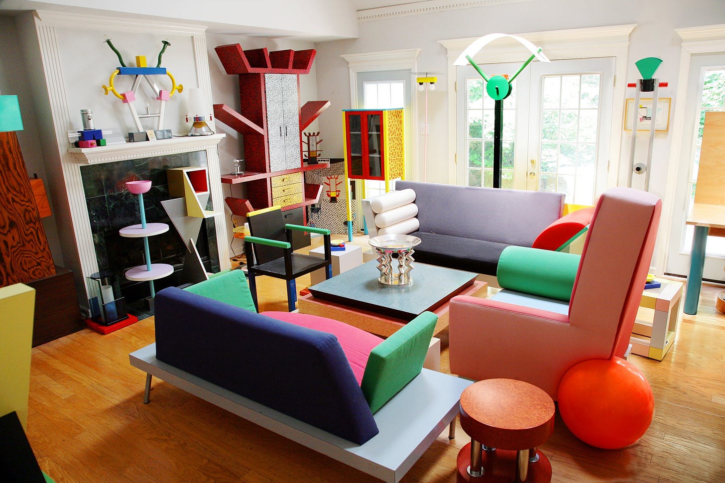
The style is sometimes referred to as Corporate Memphis due to its similarity with the garish, child-like, Memphis Group style from the ‘80s. This Italian, postmodern style was around until the late ‘80s and incorporated bold colours with geometric shapes.
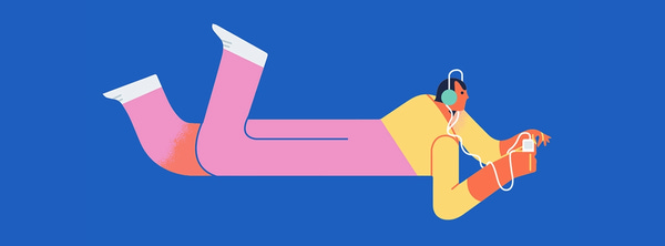
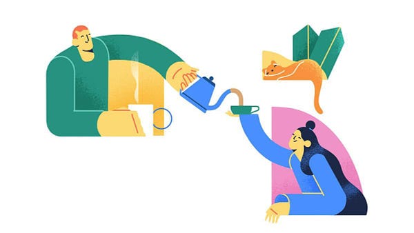
Alegria is Spanish for ‘joy’ and according to Buck is “apropos — that’s how we felt creating this fun, playful world.” They “designed and built a scalable system rooted in flat, minimal, geometric shapes. The figures are abstracted — oversized limbs and non-representational skin colors help them instantly achieve a universal feel.”
Beacon agency had a look over the last 100 years to see where Alegria originated. It began with artists such as A.M.Cassandre, during the Art Deco style of the ‘20s, which used “a limited colour palette, geometric shapes, and a general sense of movement and motion by design”.
However, whilst the Art Deco style (which I love) had many similarities to Alegria (which I don’t), it is completely different due to what it is trying to subconsciously convey and for that reason has quickly attracted a lot of contempt and animosity.
It then progressed with Apple moving from skeuomorphism (which tries to mimic real life) for its app icons (picture on the right), to a more flat, ‘modern’ style (picture on the left).
So why is this style of art everywhere and why do so many people hate it? The intention, when designing the style, was to create joyful, positive characters who were always moving or having fun. Everybody would be included because skin colours were blue or purple, what’s not to like?
First the easy part, why it's everywhere. In short, it’s easy. Easy to produce, easy to copy and easy to animate. With ease comes speed and with speed comes cost saving. All companies want the same product but cheaper. And when one company successfully uses a cheaper design to make the same amount of money, all companies want a piece of the action.
Corporates can hire a design team to suggest a few colour palettes and designs and it can then be passed over to their in-house designers to produce more and more designs but on a budget.
But although the designs have been working to date, as noted above, there is a growing resentment towards the style. One reason for this is the double edged sword of ease and cheapness.
Whilst initially people are taken aback by a new idea, over time, subconsciously or not, they can detect if something has had effort put into it. “This company clearly doesn’t think it has to spend much money to retain me as a customer, why should I stay, I’m not a pushover.”
People can also, subconsciously, detect beauty. Natural proportions, symmetry and golden ratios all contribute to making things look beautiful but these images contain none of those things. They are out of proportion, with tiny heads and large arms, they are fundamentally ugly, Da Vinci would be rolling in his grave.
But somehow, to the masses, they work and continue to do so. Which leads on to the other reason a large minority can’t stand the images.
This style tries to make people feel happy, attempts to portray the world as some kind of utopia with corporates as their best mates, looking out for them and doing what’s best for them. However, the childlike imagery infantilises the population, making them feel inferior, needing a ‘corporate’ daddy to tell them what to do. It makes them lower their guard, often at times when it is most needed (e.g. images placed next to terms and conditions).
For example, these images have been used with the vaccine rollout.
In this case, as some commentators pointed out, the mouths are missing. Was this intentional, if so why? Some suggested it is saying, don’t ask questions, just do as you’re told, which fits in with the whole Alegria style.
A lot of people don’t like being belittled and told what to do, so is another reason why this style is so hated. Whilst doing my research for this article there are many forums dedicated to hating this artwork!
Another reason people can’t stand to look at these images, is that to many, it represents globalism and collectivism. Greedily, lazily and with a large helping of wokeness, corporates have embraced this style because it includes everyone and excludes no one. This means a product can be sold to the whole world using the same image with the added bonus of not offending anyone.
However, many people don’t want to be part of a large group, they want to be an individual. They want their own style and if they are going to have something sold to them, they want it targeted specifically at them. They don’t want to see these unhuman images, they want to see humans that look like them, having real human interactions and without being made to feel guilty about enjoying looking at those images.
And finally, although this is just advertising and all advertising is slightly sinister, most sinister of all, these images arose out of the Cambridge Analytica scandal. Facebook wanted the public to forget the bad things the company was doing and had done. It wanted consumers to think of the company as a friend instead of the big tech corporate that it really was.
In reality, global corporates are predominantly interested in one thing and one thing only, money. By using these bendy armed, disproportionate and joyful characters, companies are conning people into thinking they are benevolent charities, acting in your best interests.
To me, they are a warning signal, a red flag, that I need to be on my guard and that, potentially, whatever is being said next to the images is not in my best interests. So perhaps they are a good thing, an early warning system but only if the veil has been lifted for you.
To answer my question in the title, GloboHomo is both sinister and lazy. Sinister in that it attempts to deceive and lazy because it tries to fit us all into one box for financial and possibly political and ideological reasons. But maybe you like the style. Let me know your thoughts in the comments below.









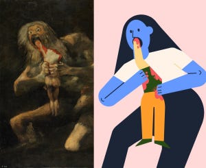
I've complained about this art forever. It's a bit of a throwback to the Soviet agitprop but not entirely. It's the kind of art that depersonalizes you while giving you an illusion of an identity. In other words, it's the rat of arts!
The psychiatrist Ian McGilchrist noted that, if you look at the history of art going back a few thousand years, you can see a sort of oscillation between flat, disproportionate art lacking in detail (think Medieval art), and realistic, detailed art (think Classical sculpture or Renaissance art). He further noted that this seemed to correlate to very distinct traits of the dominant society. His hypothesis is that it comes down to whether a given society is encouraging dominance of the left or the right hemisphere of the brain: the left not having any sense of the whole, and therefore missing entirely things like perspective or proportionality; the right by contrast having an immediate grasp of the whole and the relationship of the parts to that whole.
McGilchrist's theory can explain a remarkable amount about our current social pathologies, many of which are precisely what one would expect if the left hemisphere has run riot over the right. I've written up a quick introduction to his ideas here:
https://barsoom.substack.com/p/left-and-right-brains-and-politics